


CME: A Look at the Corn/Food Price Relation
US - CME's Daily Livestock Report for 16th June, 2008. 17 June 2008
 3 minute read
The rightful focus of much of the recent debate of government energy and food policy has been the relationship between corn and food prices. The camp favoring current government policies regarding corn-based ethanol CORRECTLY points out that little of the food price inflation to date can be blamed on higher corn prices as corn represents only a small portion of the cost of most consumer food items other than meat, milk and eggs. They further CORRECTLY assign credit to strong world demand and exports as the major driver of recent dairy product price increases, leaving eggs as about the only sector that one might conclude passed along higher corn prices rather quickly. Higher prices for bread and other baked goods can be attributed to corn indirectly, since wheat and corn prices are correlated, but here again the pro-current-ethanol policy lobby CORRECTLY points out that the big drivers for higher wheat and baked goods prices were back to back poor harvests in Australia, a short U.S. crop in 2006 and growing world demand. None of those correct arguments, however, mean that consumer prices will not EVENTUALLY be impacted by higher corn prices. We believe that process is just getting started, especially with last week’s explosion of grain and feed prices in the wake of early-season crop production challenges.
| E-Livestock Volume | 6/16/08 | 6/13/08 | 6/9/08 |
|---|---|---|---|
| LE (E-Live Cattle): | 7,804 | 9,090 | 7,843 |
| GF (E-Feeder Cattle): | 598 | 378 | 413 |
| HE (E-Lean Hogs): | 14,765 | 13,225 | 20,731 |
The graphs below show the consumer price indexes for several classes of products, with 1982 to 1984 serving as the base (100 Index) period. Note in the top, longer-term graph that the Poultry and Meats indexes have generally lagged both the All Items and Foods indexes since about 1990. That relationship is, we believe, the result of both efficiency improvements in the poultry and meat production and processing sectors and relatively low feed costs.
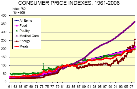
Another interesting fact from this graph is that energy has only recently caught up with and surpassed
the broader All Items index. Most consumers probably don’t realize just how much of a bargain, relative to other
items, energy had become in the years since the mid 1980s but their behavior showed they understood it: Is
there any wonder why SUV’s and huge pickups became so popular during those years?
One of President Harry Truman’s frequent admonitions was “Study your history!” We would, with due
respect, paraphrase the plain-spoken Missourian and say “Study the correct history.” While recent patterns of
price changes may be interesting, they were generated by markets that have little in common with those of this
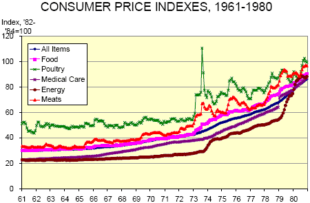
post-ethanol world. In that vein, consider the bottom graph which excerpts just the period of 1961-1980 and includes
the major demand shifts of the early 1970s as well as the first Arab oil embargo of 1973. In those years,
poultry and meat prices LED the Food and All Items indexes upward while Medical Care and Energy lagged behind.
Food, meats and poultry prices exploded after the 1973 Russian grain deal that effectively opened the
world market for grain. Meat prices grew by 25% and poultry prices by 40% in 1973 while food prices in general
grew by 14% for both ‘73 and ‘74. These three indexes rose faster than all of the others all the way into the mid-
1980s. We believe that the meat and poultry sectors were able to respond MUCH more quickly in the 1970s
than they can today due to lower fixed costs. The output adjustments and price increases remain to be seen.
Don’t expect the Meat or Poultry CPIs to catch Medical Care, but marked increases are coming.