


CME Report: Poultry Market on the Rise
US - USDA’s monthly Agricultural Price publication was released on Thursday and we think its output-to-feed price ratios are quite telling regarding today’s profit situation in the livestock and poultry sectors, write Steve Meyer & Len Steiner. 1 September 2014
 4 minute read
 By:
By: USDA’s monthly Agricultural Price publication was released on Thursday and we think its output-to-feed price ratios are quite telling regarding today’s profit situation in the livestock and poultry sectors.
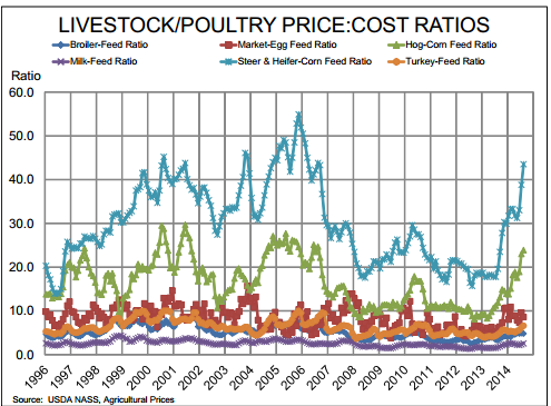
As can be clearly seen in the chart at lower left, conditions in the beef and pork sectors have improved dramatically in just the past 12 months after spending nearly six years in tough, tough straits. Those periods, of course, were characterised by significantly higher feed costs and, in some years, relatively low output prices.
But the steer & heifer:corn and hog:corn ratios have now returned to levels that, even relative to long run historical levels indicate profits and coming expansion. Neither ratio is very close to all time highs but we know that both sectors are seeing record profits — at least at some levels.
Cow-calf operations are enjoying by far their best year ever and may do even better in 2015. Feedlots have turned some handsome profits on closeouts this year but are in the process of bidding any future profits away in a mad scramble for feeders.
Hog producers of just about every variety have seen record output prices and will realise record profits as long as their PEDv losses are not larger in percentage terms than this year’s price increases. The August ratio for cattle are 122 per cent higher than one year ago.
The hog:corn ratio was just over double the 2013 level and though they pale in comparison to beef and pork, the other ratios are much better than one year ago as well. The egg:feed ratio is 41 per cent higher than in 2013 while the broiler and turkey ratios are up 45 per cent and 43 per cent, respectively.
The milk ratio has increased by just over 50 per cent relative to last year. So what do these mean for the future? The short answer is bigger supplies. Given the size of this year’s crop, the feed cost denominators of these ratios are not going to rise and, in fact, may still decline.
Any harves time pressure will push the ratios higher and provide more incentive for growth in all of these sectors. The beef industry, with its long generation intervals and resulting slow response times, has historically enjoyed the longest runs of positive ratios and will do so again.
The hog ratio will decline as we go through seasonally lower prices but will, as it has done in the past, remain positive for two to three years, pretty much in line with the historical hog cycle. The historic data in this chart clearly points out just how quickly the various poultry sectors can respond to good times with those lines resembling saw teeth in comparison to the lines for hogs and cattle.
And the milk:feed ratio is the smoothest of all — attributable, we think, to the dairy cow’s dramatically different input-output relationship owing primarily to milk being 87 per cent water.