


Longer-term chart analysis: feed and livestock futures
It's time to pay close attention to the longer-term weekly and monthly continuation charts for nearby grains, cattle and pig futures 18 November 2020
 2 minute read
 By:
By: History shows that strong-trending markets tend to have their prices gravitate toward historical highs or lows that are depicted on the weekly and monthly charts. Longer-term charts also tend to weed out the sometimes distracting “market noise” that can be seen on the shorter-term daily charts.
Corn
The weekly corn futures chart shows a strong bull market is in play. The next upside target for the bulls is the 2015 and 2016 highs that were notched just below the $4.40 area. See at the bottom of the chart the Moving Average Convergence Divergence (MACD) indicator. Note the MACD’s posture is nearing the postures of the indicator that were seen in 2015 and 2019. Such is an early clue that this latest rally could be nearing its peak sooner rather than later. Once the blue line of the MACD starts to turn down on the weekly chart, that would be a solid clue the corn market has topped out.

© Jim Wyckoff
© Jim Wyckoff
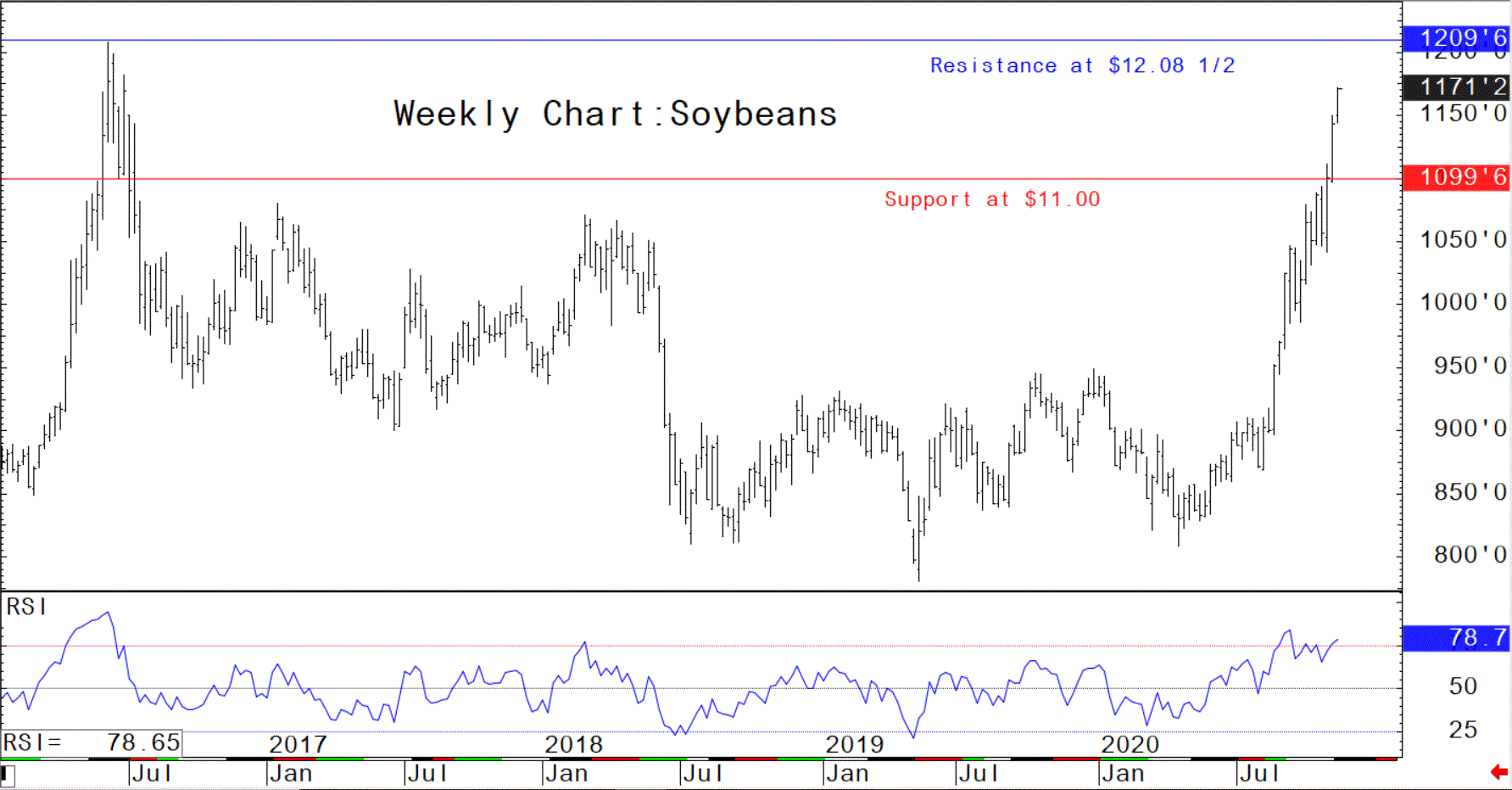
Soybeans
The soybean futures market has seen a strong upside price move that began in late April. The next upside price target for the powerful bulls is pushing prices to the 2016 high of $12.08 1/2, basis nearby futures. While the steep price uptrend is presently firmly in place on the weekly chart, do note that the Relative Strength Index (RSI) has moved into overbought territory (above 70.0). The last time the RSI was so high, on the weekly chart, was the summer of 2016, when the soybean market put in a major top.
© Jim Wyckoff
© Jim Wyckoff
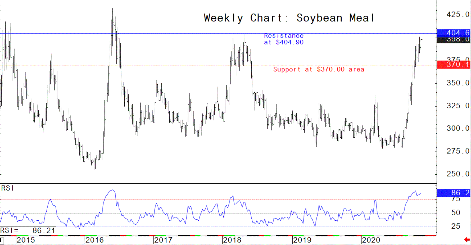
Soybean Meal
The meal futures market has screamed higher in recent weeks, after playing some catch-up to the rally in soybeans. Like soybeans, meal futures are well into overbought territory as seen by the RSI on the weekly chart. The RSI recently moved to near the 2016 peak of the indicator and has rolled over—suggesting a market top is closer at hand, just like occurred in 2016.
© Jim Wyckoff
© Jim Wyckoff
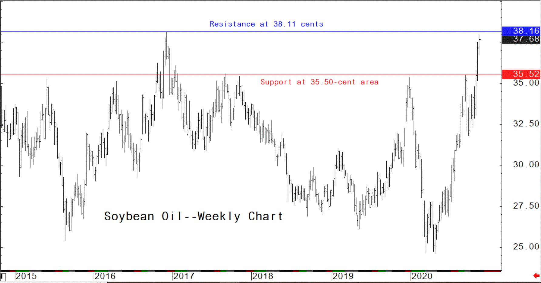
Soybean Oil
Remember that longer-term charts show strong-trending price moves gravitating toward historical highs and lows. It certainly appears nearby soybean oil futures are gravitating toward the 2016 high of 38.11 cents, which is stiff longer-term technical resistance that could stop the rally.
© Jim Wyckoff
© Jim Wyckoff
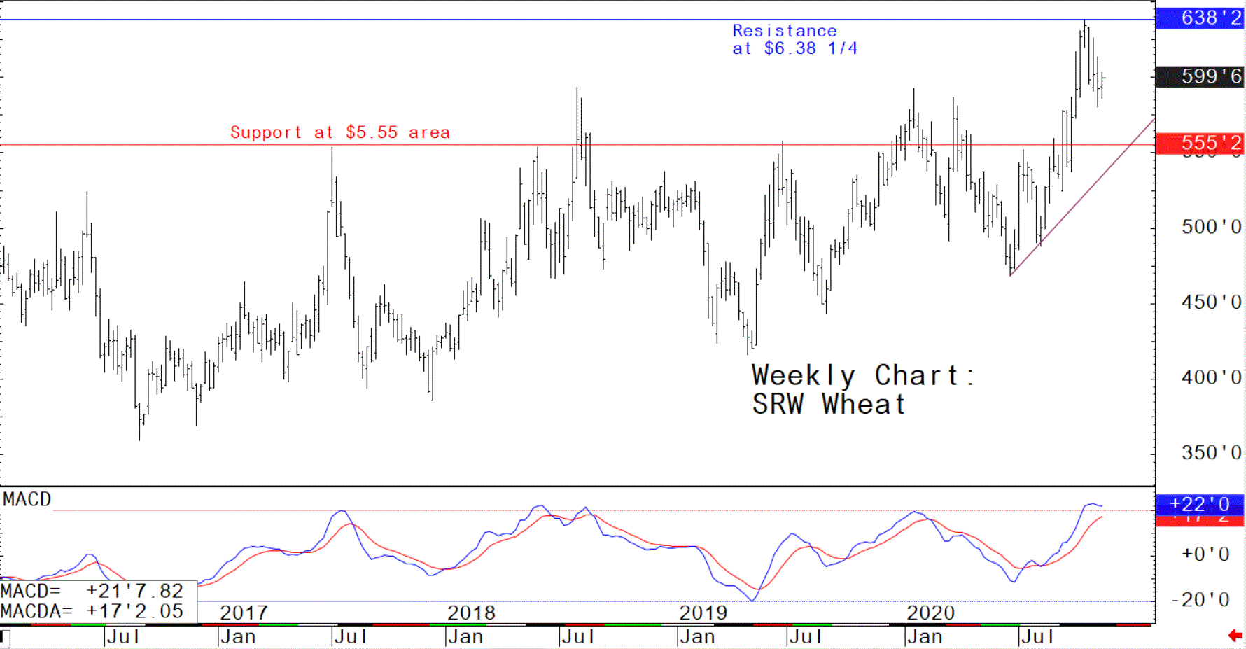
SRW Wheat
Soft red winter wheat futures prices are in a longer-term uptrend as seen on the weekly continuation chart for nearby futures, and just a few weeks ago hit a multi-year high. The bulls are strong and the pullback from the high seen in October is so far just a downside correction in the prevailing uptrend. However, see that the MACD indicator has seen its blue line start to rollover from its uptrend, which is an early warning signal the wheat market bulls are exhausted. Note that the previous times on the chart when the blue MACD line started to roll over at such elevated levels were near the price peaks in 2017, 2018 and 2019.
© Jim Wyckoff
© Jim Wyckoff
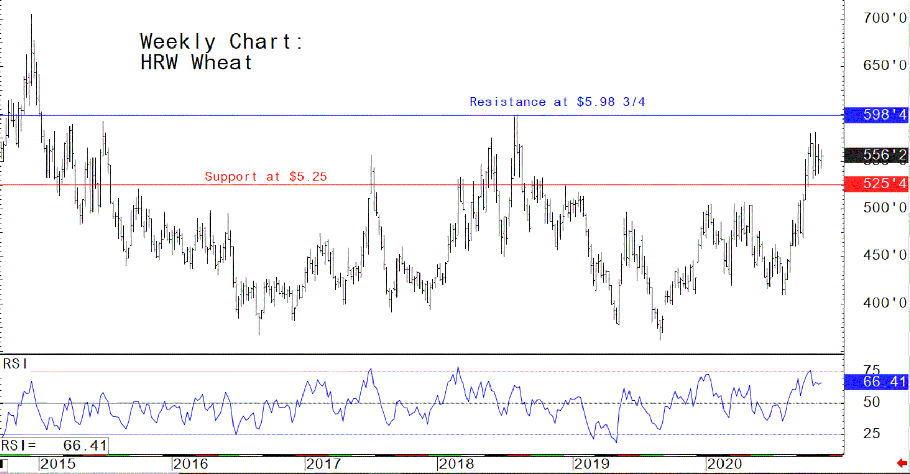
HRW Wheat
The weekly hard red winter wheat futures chart is also in a steep price uptrend, but the RSI indicator has moved above 70.00 (overbought) and turned down, which is what happened when the market topped out 2017 and 2018.
© Jim Wyckoff
© Jim Wyckoff
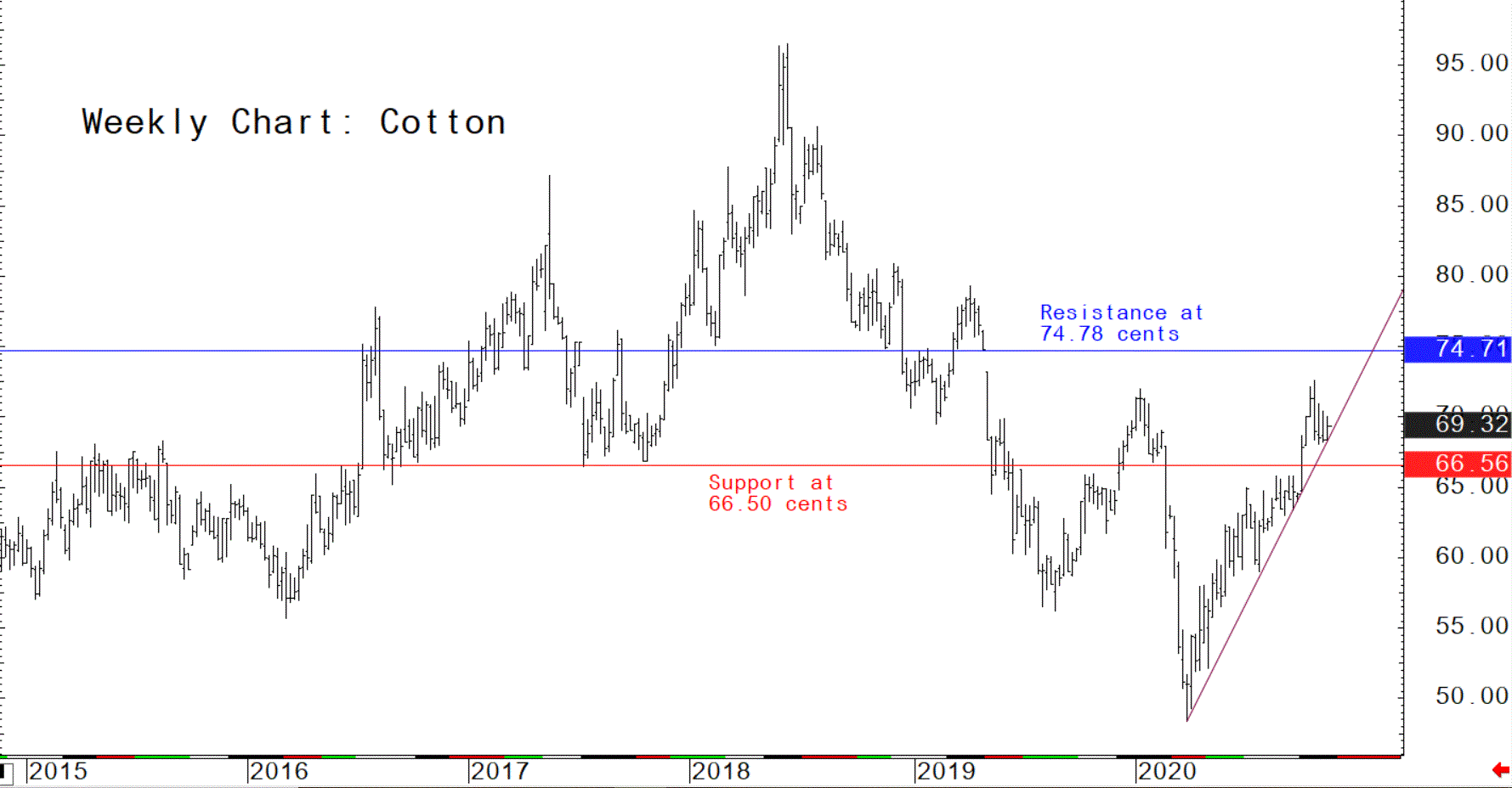
Cotton
The cotton futures market bulls remain in firm technical control as prices are creeping right up an uptrend line seen on the weekly chart. The bulls’ next upside price objective is to fill a downside price gap created on the weekly chart in May of 2019. A drop in prices below strong chart support at the 66.50-cent area would put the bull market run in jeopardy.
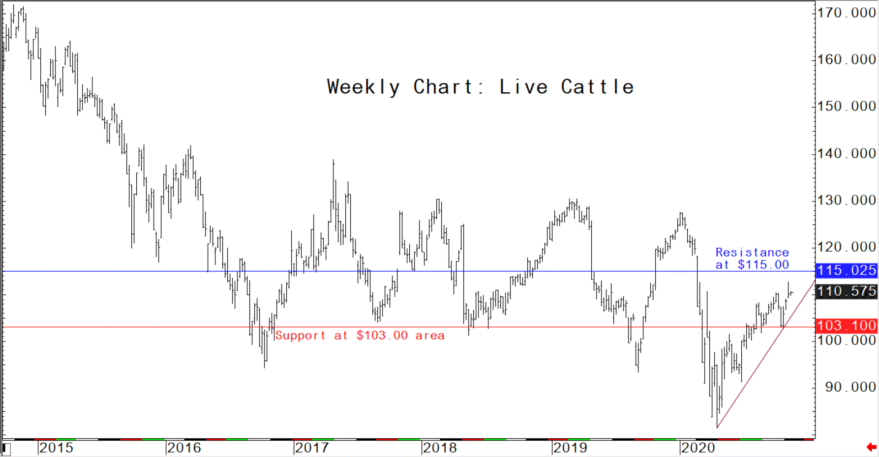
Live Cattle
See on the weekly chart for live cattle futures that prices have made a strong rebound from the 2020 low. Dating back to 2016, each time the live cattle futures market has started to rally from a price level below $100.00, prices have reached at least $127 and has high as $139. Technical odds suggest the live cattle market has significantly more room to run on the upside in the coming weeks and months.
© Jim Wyckoff
© Jim Wyckoff
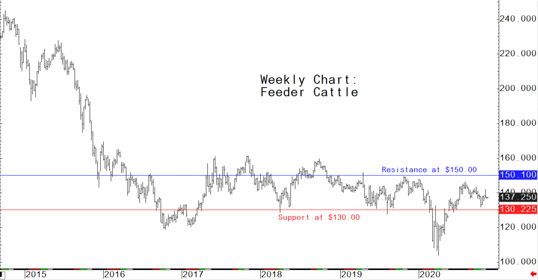
Feeder Cattle
The feeder cattle futures market has made a strong rebound from the 2020 low, but the price uptrend has stalled out, as seen on the weekly chart. It will take a move in nearby feeder cattle futures prices above longer-term chart resistance at $150.00 to kick of a solid bull run. If the fat cattle futures continue to push higher, amid its more bullish chart, then feeder futures are likely to tag along to a degree.
© Jim Wyckoff
© Jim Wyckoff
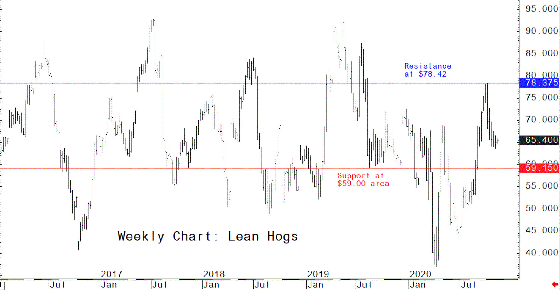
Lean Hogs
The weekly continuation chart for nearby lean hog futures is kind of sloppy, and that’s always been the case. Reason: The big price differentials in the futures contracts that are a regular phenomenon. Still, one can glean clues by look at the weekly chart. The present posture of the weekly lean hog futures chart suggests choppy and sideways trading in the coming weeks, between the support and resistance lines seen on the chart.
© Jim Wyckoff
© Jim Wyckoff
Educational spotlight: the MACD defined
The Moving Average Convergence Divergence (MACD) indicator has the past few years become one of the more popular computer-generated technical indicators.
The MACD, developed by Gerald Appel, is both a trend follower and a market momentum indicator (an oscillator). The MACD is the difference between a fast exponential moving average and a slow exponential moving average. An exponential moving average is a weighted moving average that usually assigns a greater weight to more recent price action.
The name “Moving Average Convergence Divergence” originated from the fact that the fast exponential moving average is continually converging toward or diverging away from the slow exponential moving average. A third, dotted exponential moving average of the MACD (the "trigger" or the signal line) is then plotted on top of the MACD.
Parameters:
Mov1: The time period for the first exponential moving average. The default value is usually 12, referring to 12 bars of whatever timeframe plotted on the chart. (This is the fast moving average.)
Mov2: The time period for the subtracted exponential moving average. The default value is usually 26, referring to 26 bars. (This is the slow moving average.)
Trigger: The period of 9 bars for the signal line representing an additional exponential moving average.
The MACD study can be interpreted like any other trend-following analysis: One line crossing another indicates either a buy or sell signal. When the MACD crosses above the signal line, an uptrend may be starting, suggesting a buy. Conversely, the crossing below the signal line may indicate a downtrend and a sell signal. The crossover signals are more reliable when applied to weekly charts, though this indicator may be applied to daily charts for short-term trading.
The MACD can signal overbought and oversold trends, if analyzed as an oscillator that fluctuates above and below a zero line. The market is oversold (buy signal) when both lines are below zero, and it is overbought (sell signal) when the two lines are above the zero line.
The MACD can also help identify divergences between the indicator and price activity, which may signal trend reversals or trend losing momentum. A bearish divergence occurs when the MACD is making new lows while prices fail to reach new lows. This can be an early signal of a downtrend losing momentum. A bullish divergence occurs when the MACD is making new highs while prices fail to reach new highs. Both of these signals are most serious when they occur at relatively overbought/oversold levels. Weekly charts are more reliable than daily for divergence analysis with the MACD indicator.
For more details on the MACD, Appel has a book in print, entitled: "The Moving Average Convergence-Divergence Trading Method."